PERENN : Branding & Packaging

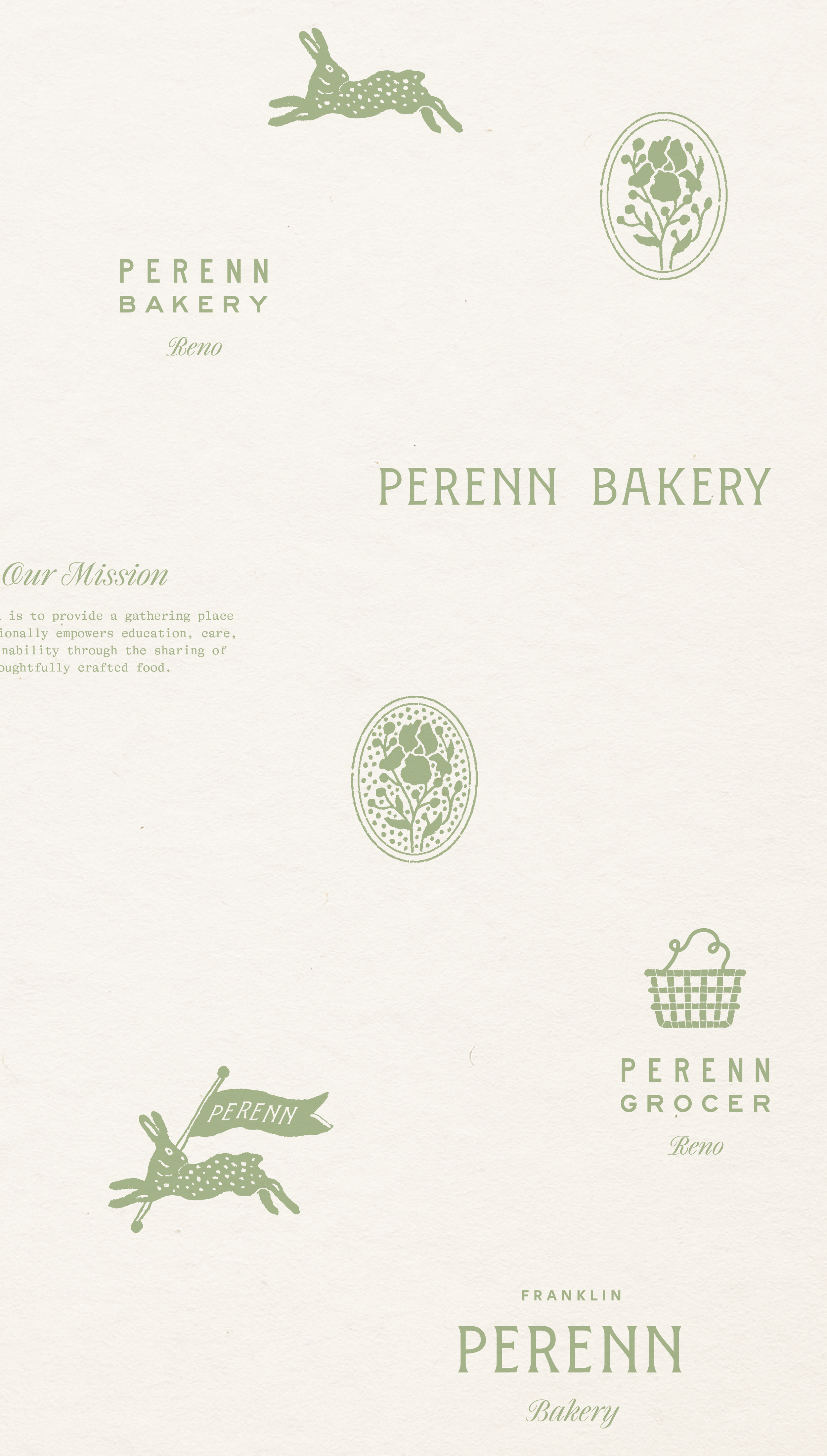
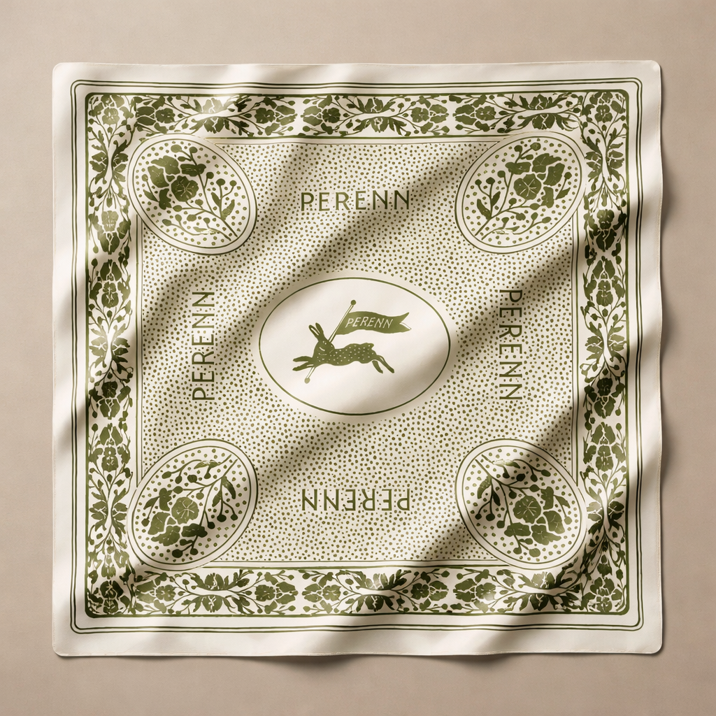
This identity builds on the bakery’s soft, organic roots while introducing a more graphic and contemporary evolution. The brand plays between romance and restraint, allowing sweetness and structure to coexist. Across packaging and printed materials, craft, charm, and whimsy come together to create a timeless bakery identity.

2024 : Franklin, TN

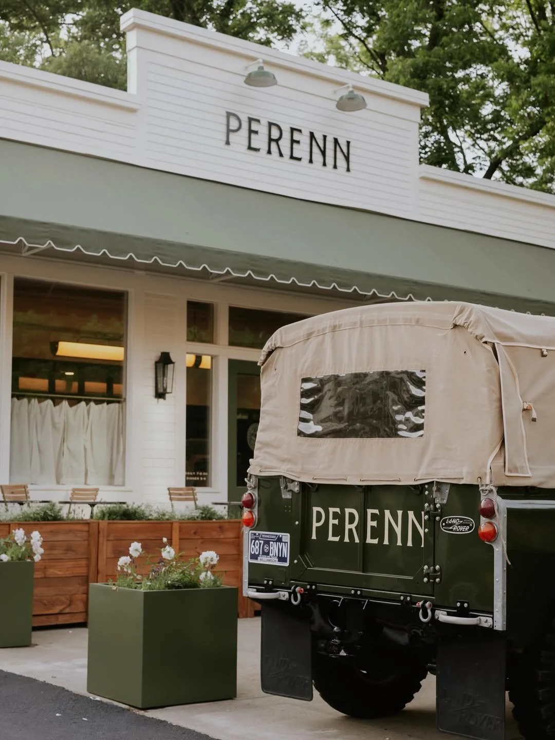
Green bakery sign with the words 'PERENN Bakery' in white text.
Minimalist floral crest designed with the words "RENO FRANKLIN" in green capital letters and a central illustration of a branch with leaves enclosed in an oval shape.
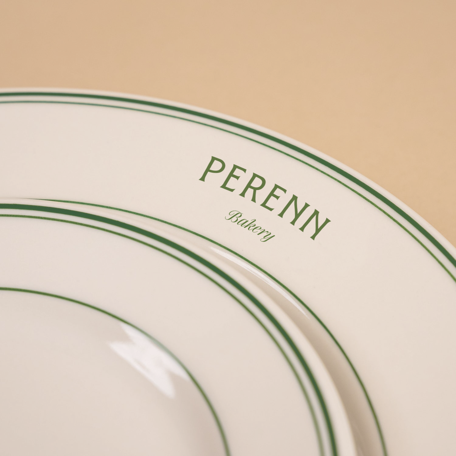
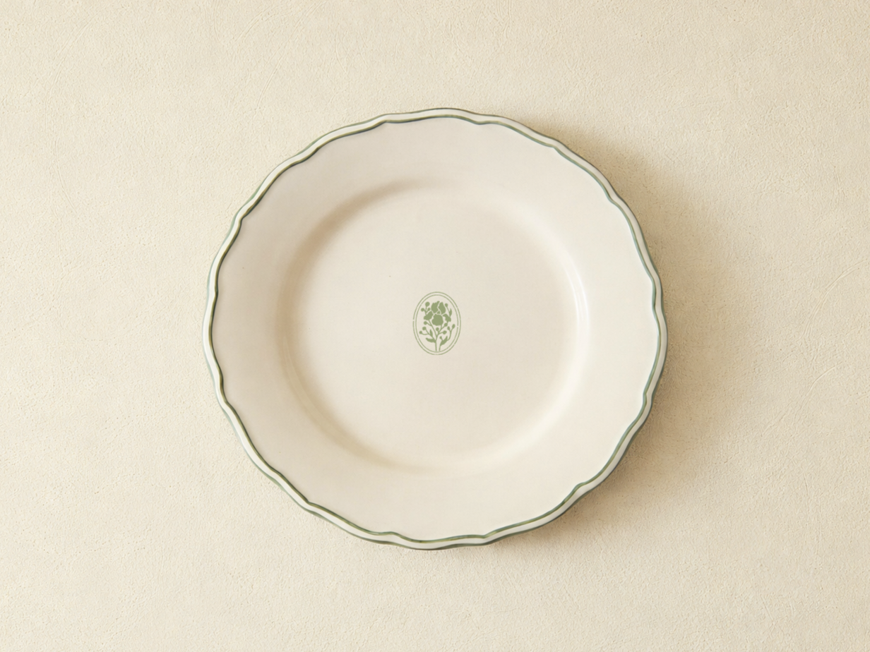
Close-up of bakery plateware branded 'Perenn Bakery' on a white background with green borders.
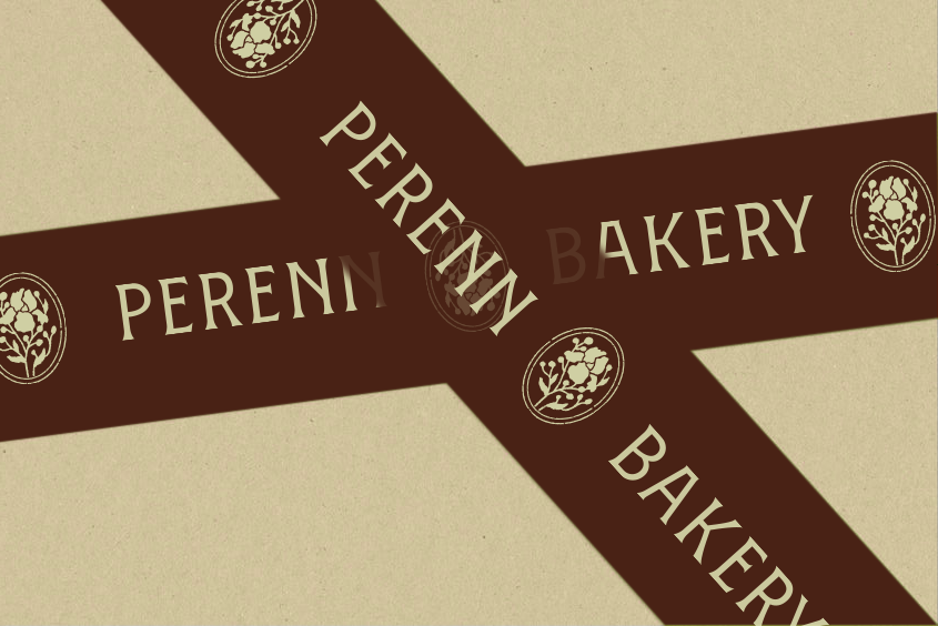
Close-up of a bakery logo with the words "Perennial Bakery" in beige on brown ribbons and a beige background.
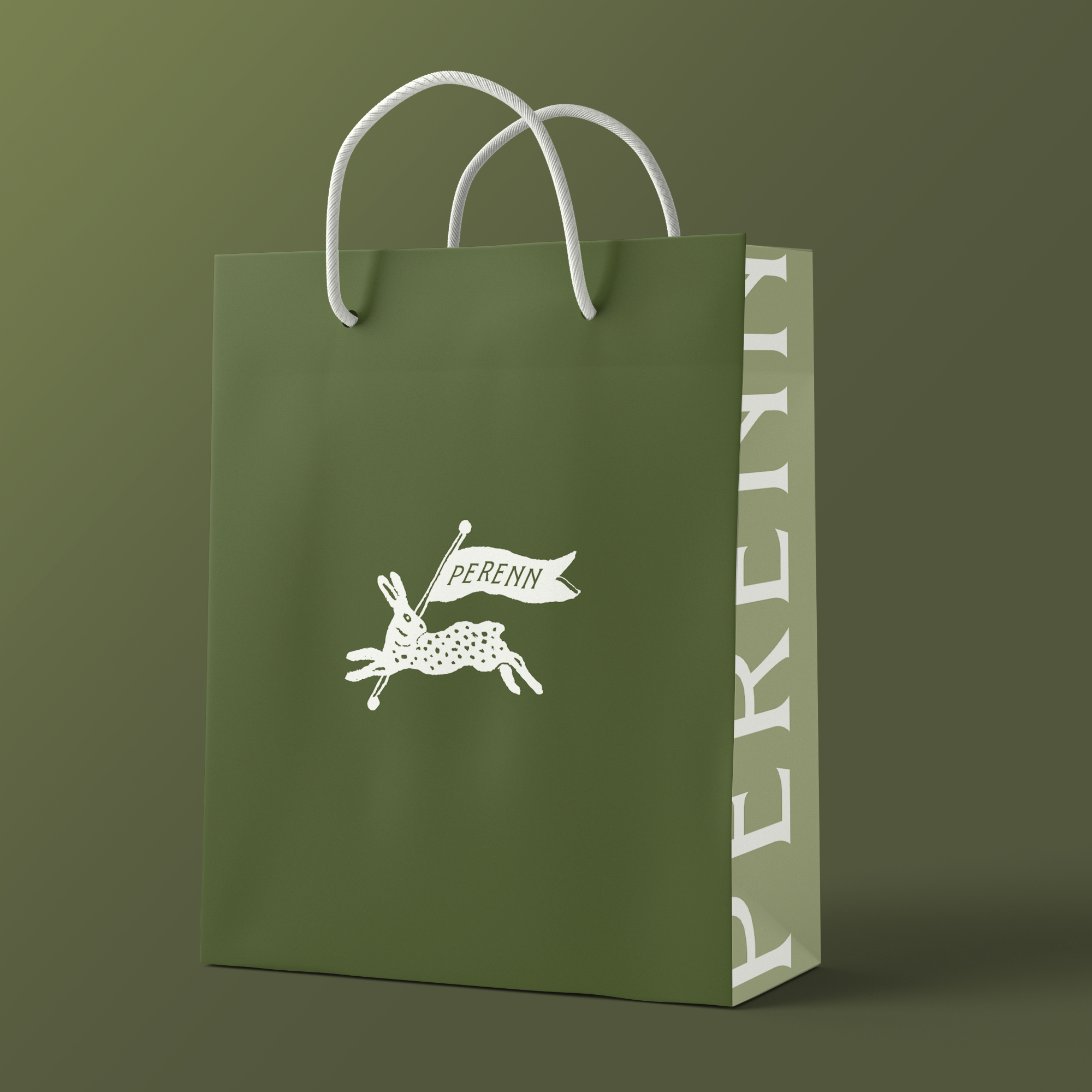
A green paper shopping bag with white handles and the Perenn logo, on a matching green background.